MELNIK
Client
KVS, property developer
My role
Naming, Logo design, Corporate identity design
Project
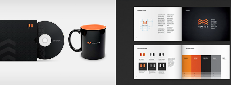
Naming, logo design, and identity for the “Melnik” business center, near St. Petersburg’s historic core. The name references the former flour mills; the identity links local heritage with contemporary architecture.

The mark follows the building’s massing—four balanced volumes slightly rotated toward each other—while embedding the name’s initial letters. The logotype is strictly Cyrillic (“Мельник”). The system employs concise geometry, a precise grid, and a restrained palette of stone, metal, and water; typography is a modern grotesk with strong Cyrillic. Applications: exterior/interior signage and glass doors, floor wayfinding, stationery, a tenant landing page, and digital templates.